Futurescape Chronicles
Three magazine covers for an imagined publication about the ways technology, culture, science, and human life shape one another.
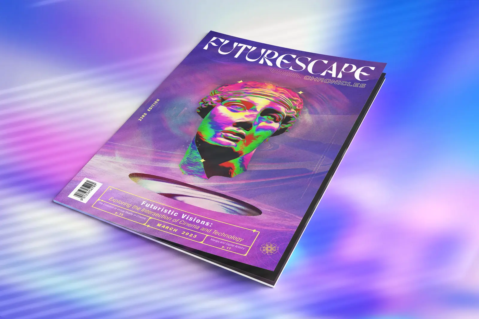
Tools & roles
A magazine I wanted to read.
Futurescape began with subjects I keep coming back to: cinema, technology, physics, the planet, and the changes they bring to culture and everyday life. I imagined a publication for curious readers who want to follow those connections and talk about what might come next, without treating the future as a foregone conclusion.
I used ChatGPT as a simulated creative director to explore the brief and possible directions, challenging its suggestions as the idea developed. I chose Futurescape for the space it gave the publication to move between subjects. Chronicles brought in the idea of keeping a record while we imagine the future.
Different stories, one publication.
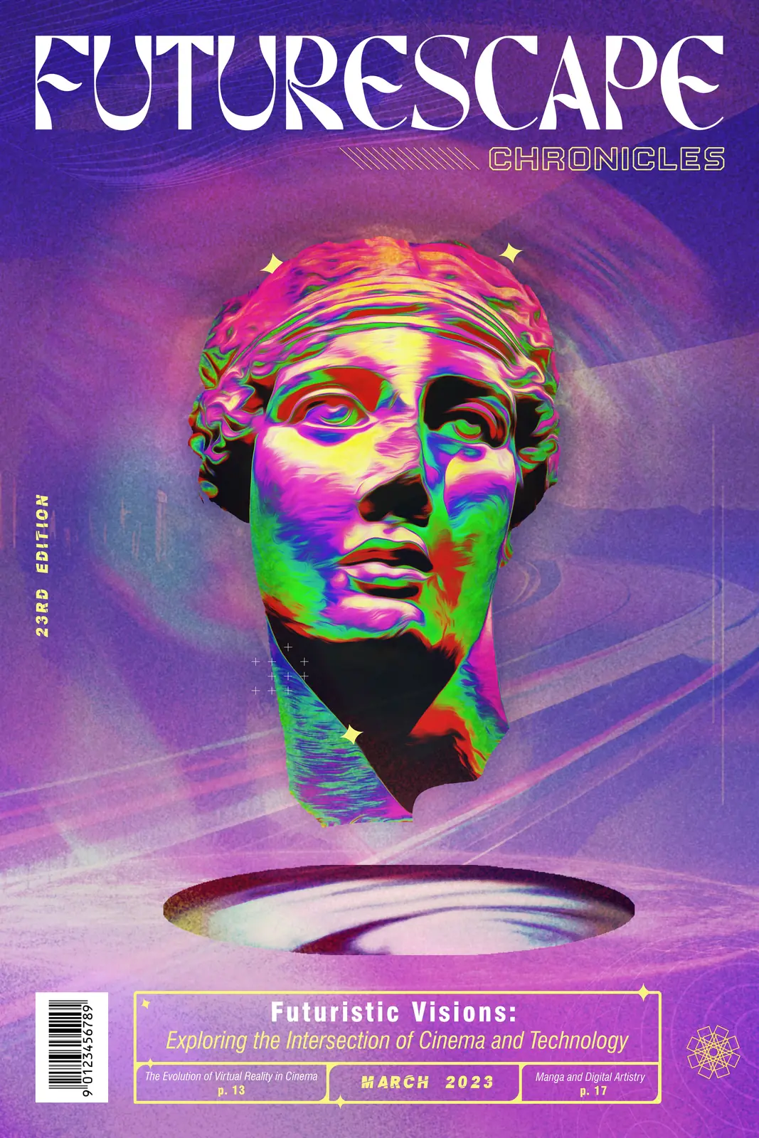
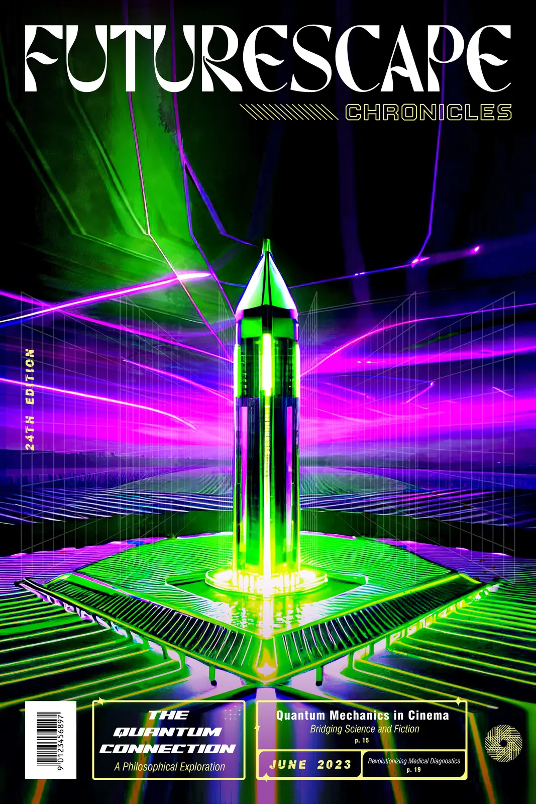
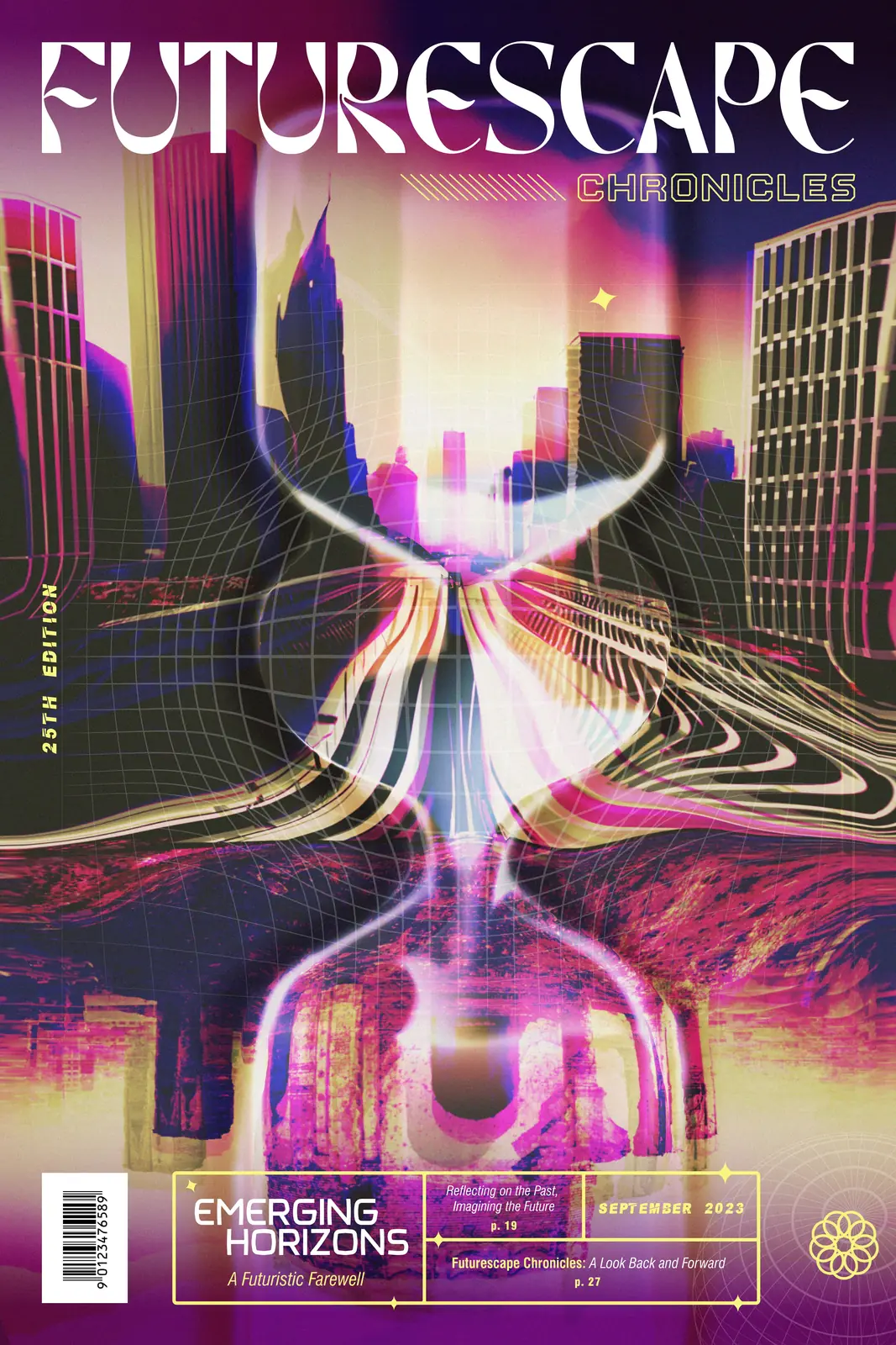
I started each cover with a different story I could imagine reading, then looked for a visual way to express it. The hard part was letting the subjects and compositions change without making the covers feel like three unrelated magazines. Some combinations of images, colors, and blending modes led nowhere; others opened up a direction I had not expected.
A record of tomorrow,
written in the present.
What gives the series continuity.
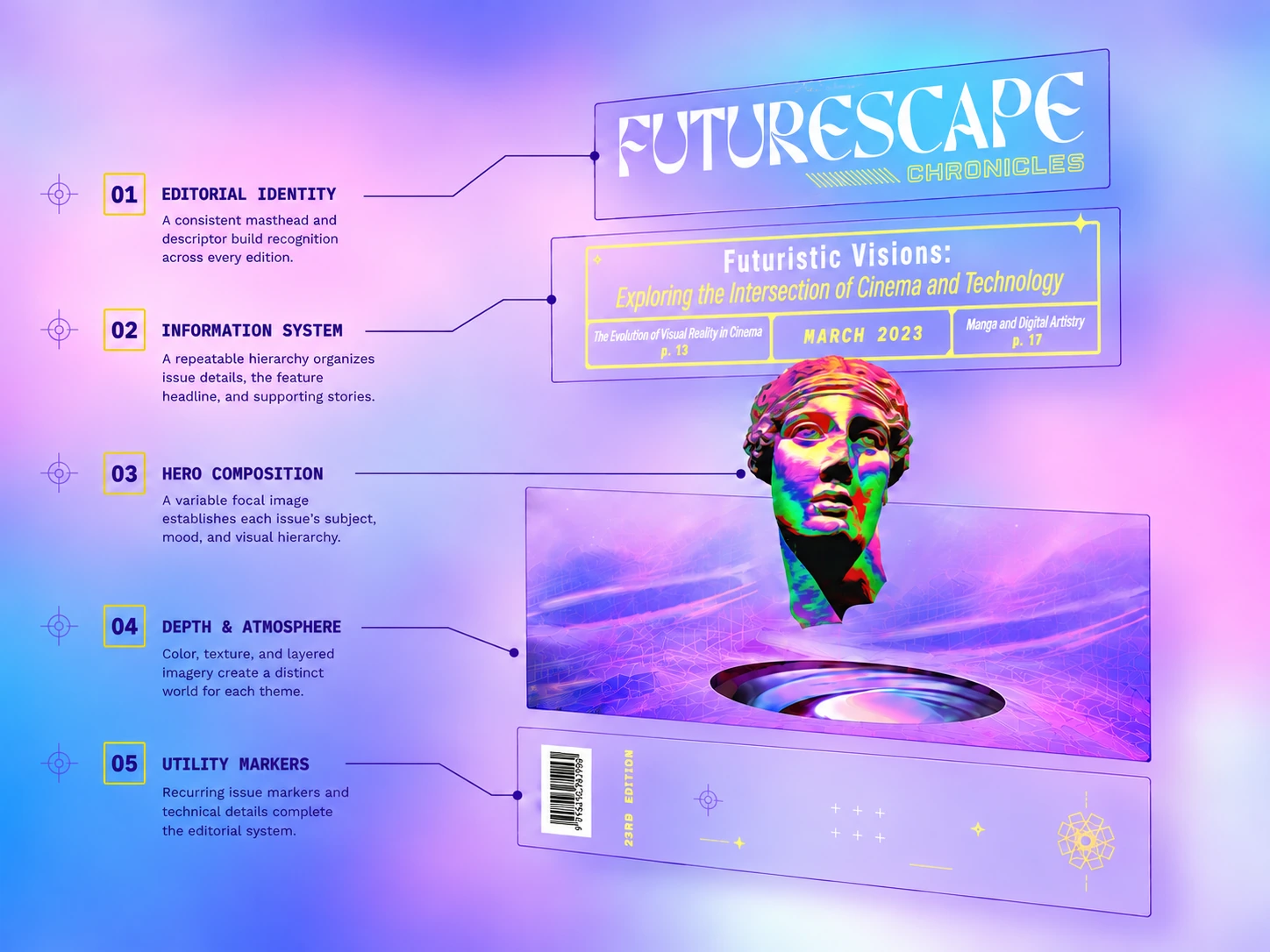
A stable reading order holds the covers together. The masthead comes first, followed by Chronicles, then the central image. The information panel comes last, carrying the lead story, date, and two supporting stories with page references. The object at the center and the atmosphere around it can change while that structure stays recognizable.
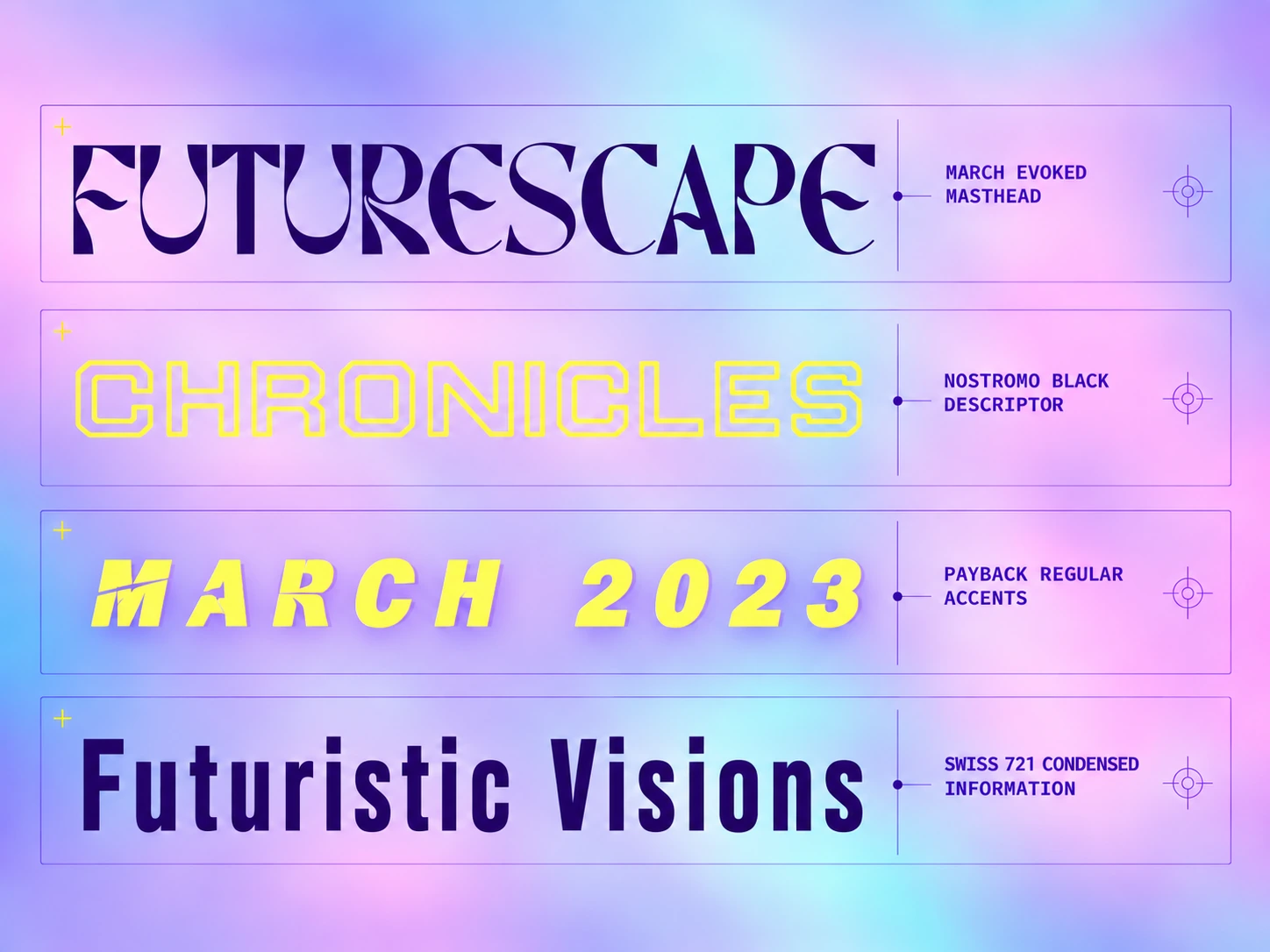
I chose March Evoked for the masthead after exploring several typefaces. I wanted something with a futuristic character that did not fall into familiar technology clichés. Nostromo Black gave Chronicles a more openly digital voice. PaybAck Regular marks occasional accents such as issue numbers and dates; Swiss 721 Condensed, across several weights, handles the information readers need to navigate the cover.
Acid yellow provides a recurring point of contrast. It appears in type, frames, and smaller details, staying visible against the violets, blues, and other saturated colors that shift between editions.
Built from many sources.
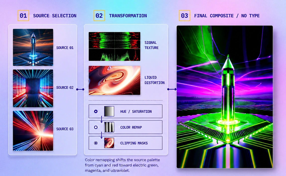
This was one of my first projects using generative imagery. For each cover, I explored multiple images with Microsoft Bing Image Creator under my direction, alongside sourced photography and original textures. I kept an image when it brought movement, context, or a useful conceptual connection; I left it out when it only added noise.
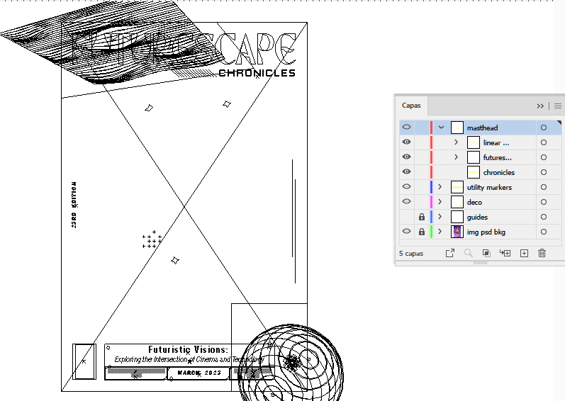
The final compositions took shape through manual work in Photoshop: combining layers, masks, blend modes, opacity, color adjustments, lighting, and retouching. In Illustrator, I designed and placed the masthead, headlines, issue information, and other editorial elements. The generated images were inputs to that process; I made the visual selections, checked the results, and approved the final covers.
Taking the covers into motion.
I also recorded a time-lapse while designing and played with a short promotional piece. Preparing the artwork for motion was part of the experiment: I separated and exported layers according to how they should move and sit in depth, then adapted them for After Effects and Premiere Pro, with audio work in Audition. A layered cover does not automatically behave the same way in another tool, and I enjoyed working through that transition.
How I would extend it today.
Futurescape is still a publication I would like to see exist. With what I know now, I would build future cover layouts in InDesign, keep Photoshop and Illustrator for the image and type assets, and use scripting to automate recurring elements. That would make room for more issues without manually repositioning the same parts each time.